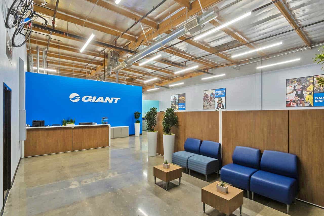
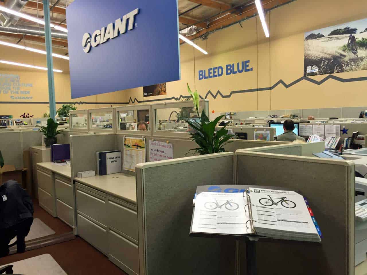
Long time Pacific Office Interiors client, Giant Bicycles was facing an office space “identity crisis.” Their existing corporate office space in Thousand Oaks was saddled with a drab, uninspired design that you could find in any 1980s office; a design that said nothing about who they are, what they do, what they love and what they stand for. So, they turned to us for help creating an authentic corporate office design that matched their corporate personality and fueled employee productivity and collaboration.
Determining Feasibility Of Authentic Corporate Office Design
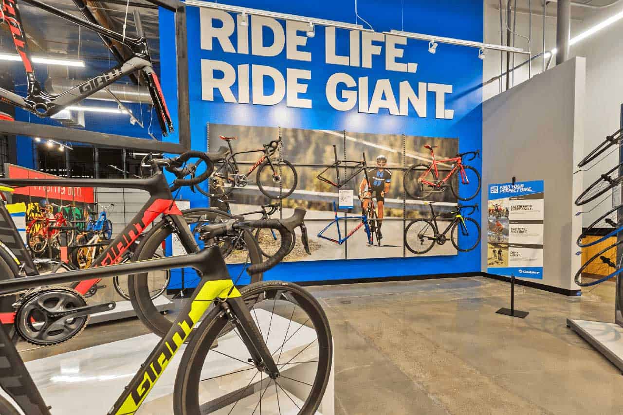
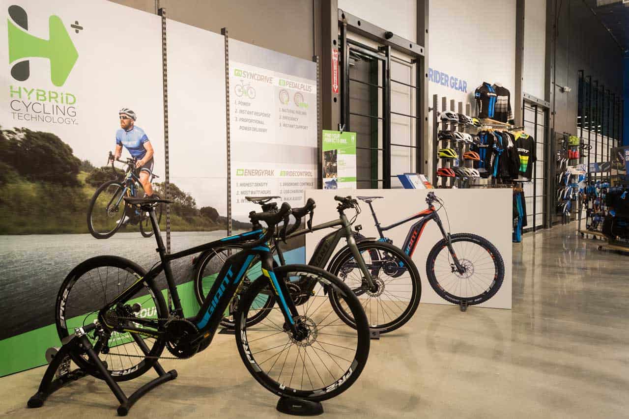
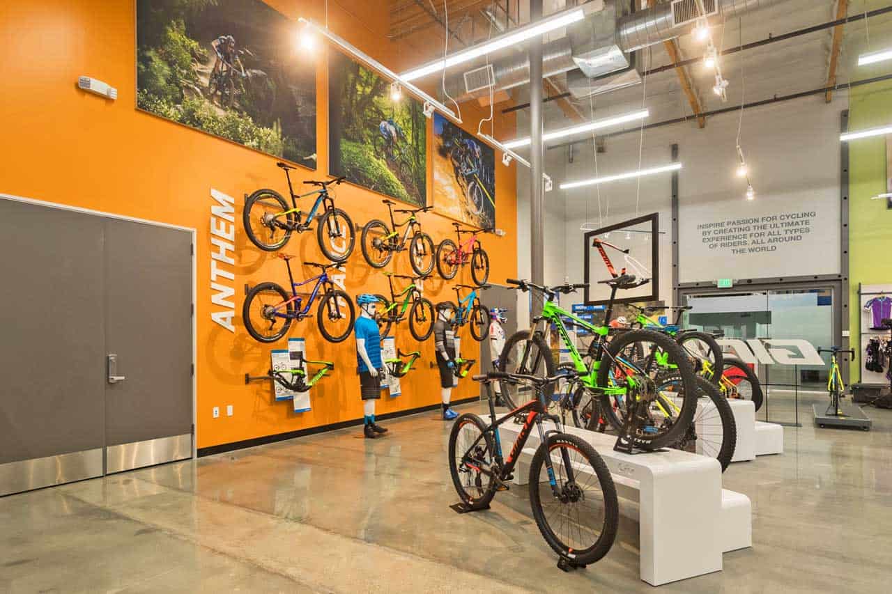
A unique feature in Giant’s vision was an integrated retail space where customers could see and purchase Giant products and where their dealers could come for training. So, the first step in their journey to achieving an authentic corporate office design was a study to determine if this could be done while accommodating employee spaces, warehousing and providing for future growth. Our team went to work and determined Giant could accommodate the retail space.
From Preliminary Design to the Final Punch List – We Handled It All
A significant value we brought to the project was our turnkey design-to-installation services. We have the skills, knowledge, resources and people to guide the project through every stage of design, space planning and utilization, specification and installation. Our project team worked closely with the team at Giant to generate everything from bubble charts, to design layouts, finish selections and 3D renderings. One especially beneficial step was the development of three different color schemes. In creating these, we made space for a larger number of Giant employees, a move that sparked excitement about and ownership of the new design.
Reuben Hernandez, the National Retail Services Manager at Giant Bicycle said, “From the first day…to our final set up and delivery, we felt confident we made the best choice in working with the POI team. We had ideas from various internal teams at Giant. What we appreciated about POI’s team is that they were always there to provide functional and realistic points of view about the furniture and office layout options.”
“Bring Your Bike to Work Day” is Every Day
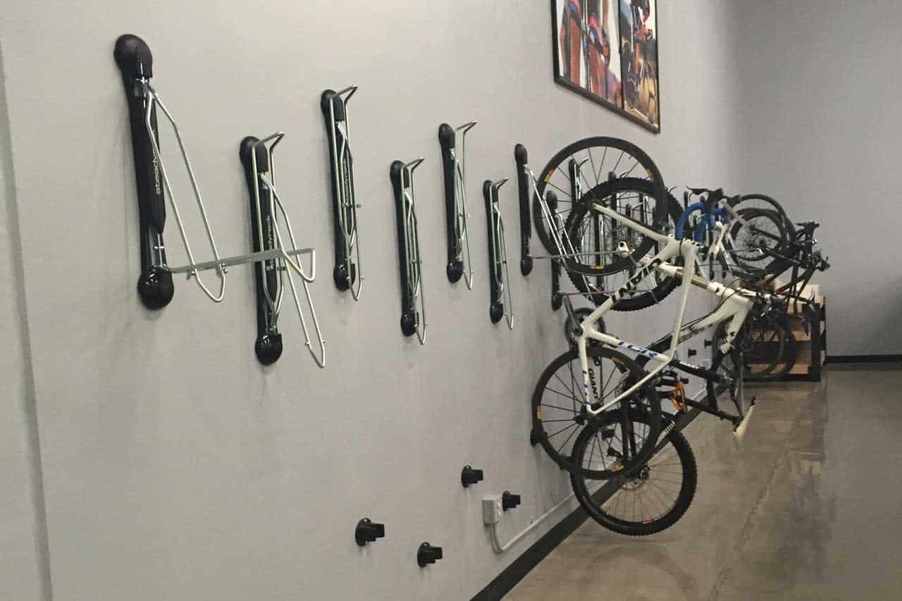
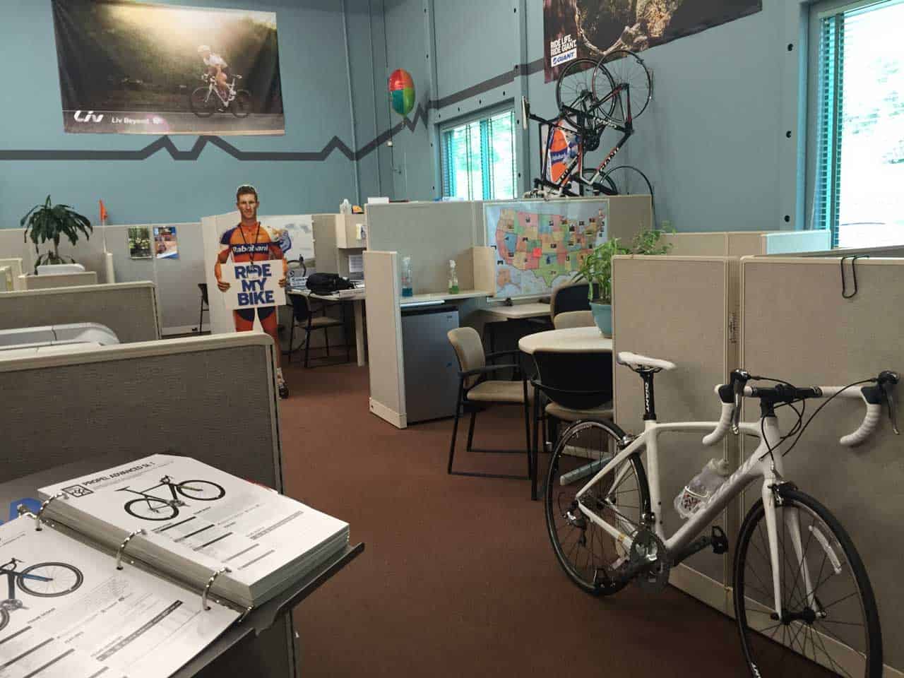
Many Giant employees ride their bicycles to work because it matches their interests and passions. Unfortunately, the old office design had no provision for safely storing bikes. Employees ended up wheeling them through the office and leaning them against their cube’s partition. This meant road grime and bike lubricants could soil the carpet and partitions.
The new design brilliantly addressed the situation. Polished concrete “bike paths” lead to various workspaces. They helped define individual spaces and eliminated the problem of soiling the new carpets. To eliminate the practice of leaning bikes against partitions, employees are now able to hang them on the wall. With the new open design, the bicycles become “wall art” that effectively tells everyone who enters that this is a bicycle company.
Since Giant’s products are used almost exclusively outside, they wanted to bring elements of the outdoors into the work environment. The bike paths laid the foundation for this vibe, with earthy color palettes and bold graphics of cycling combining to make this a truly authentic corporate office design for the world’s largest manufacturer of bicycles.
From Confined to Open – A Collaboration-Enhancing Change
The new design did away with the tired old, full-panel cubes and their lackluster furniture. In its place, we created an open design that made much more efficient use of the available space. This allowed us to provide employees with a larger work area while allowing for future growth. Each workstation provides the employee with a Haworth Compose Workstation and their ergonomic masterpiece task chair, the Very. Storage is the Haworth X-Series and the guest chair is the Zody.
Low partitions combine with the concrete bike paths and suspended ceilings to define the various areas of the new office layout. In addition, hanging glass panels in strategic locations provide additional privacy and design interest. In the new spaces, collaboration is significantly improved as employees can quickly get together, solve a problem and get back to their tasks.
Authentic Corporate Office Design Fixed A Broken Break Room
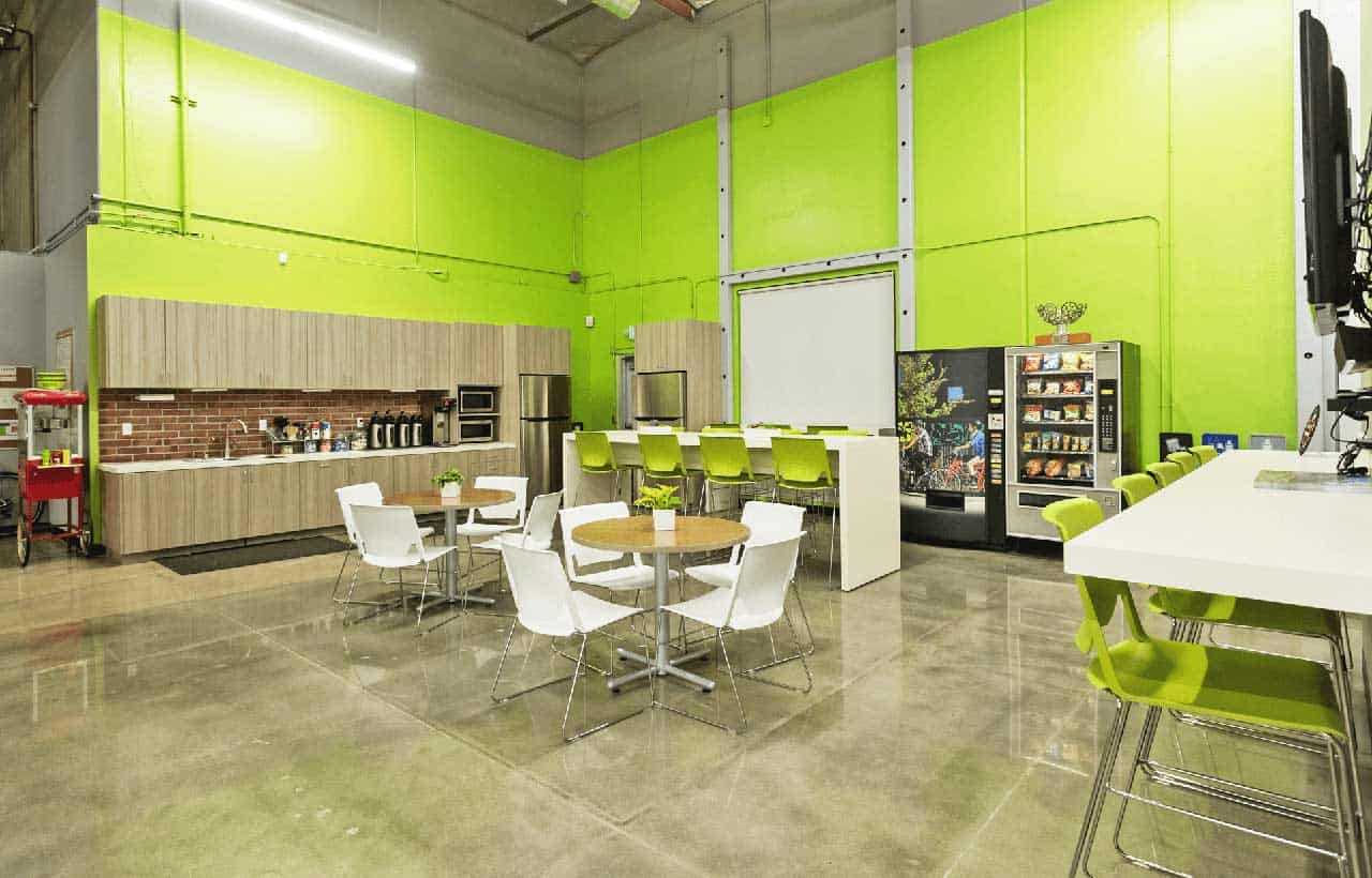
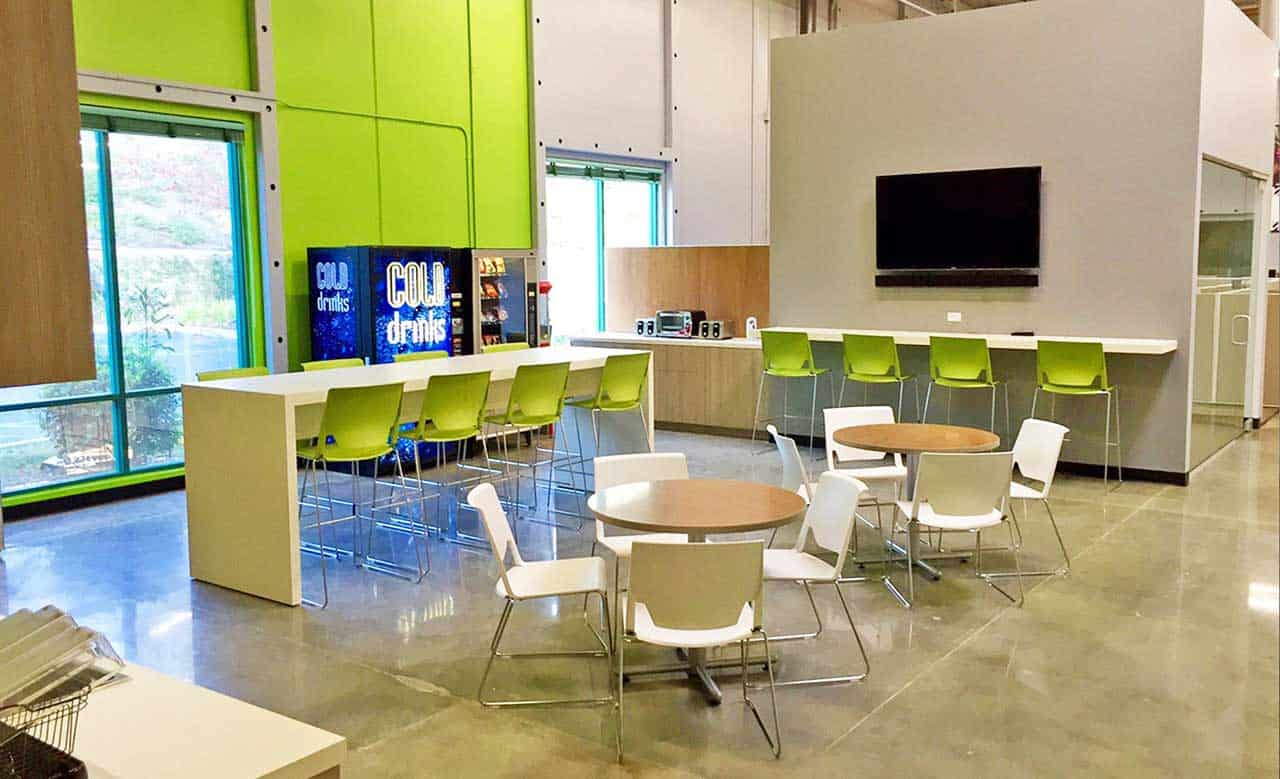
The old employee break room was rarely used; you could confidently say that it was broken. It was small, dark and uninviting. Giant wanted to revitalize the space, making it a “third place” where employees want to go, to mingle, recharge and collaborate. To satisfy this requirement, we expanded and opened up the space with a bright color palette that characterizes the space and is used on the walls and in the seating, creating a bright and lively feel.
Three different seating options are available to employees. The cafe tables are topped in an earthy brown laminate by Haworth that provide a traditional option with their comfortable Very chairs. A taller custom bar-height table in bright white provides a less formal option. Seating is provided by Haworth’s Very chairs. The third option consists of a bar-height counter under a monitor where employees can enjoy some time by themselves. The stools are from the expansive Haworth Very range. Employees are taking full advantage of the new space, a testament to the inviting nature of the design.
According to Hernandez, “They have more meals together in the new kitchen, and have since requested additional tables and seating, due to the increased use of the common space.”
Tackling the Challenge of Cookie-Cutter Conference Rooms
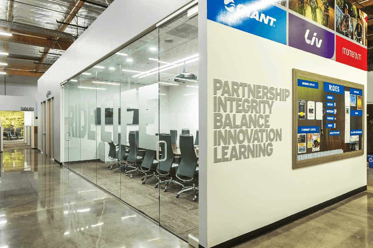
The old layout had enclosed rooms of various sizes but with cookie-cutter furnishings, all using the same tables and chairs. Not only could the spaces become stifling, in many instances, the furniture was too large for the room. Giant wanted a lot of meeting rooms; areas that could also be seen as third places. They wanted a variety of sizes and furnishing so individual work style preferences could be accommodated.
As a result of this design requirement, some areas have tables and chairs. Some have sofas. Still others feature the Allermuir Ad Lib Work Lounge, a mobile lounge chair where employees can sit and work in a different setting. Not surprisingly, these are the most popular spaces with the employees.
In a nod to one of Giant’s lines of women’s cycling gear and clothing, Liv Cycling, one conference room is finished in purple, one of the predominant accent colors in the line.
This approach also mirrored one of Giant’s key messages, “Every road has its own personality.” The meeting spaces now had their own personality too, a huge improvement over the previous design.
Authentic Corporate Office Design – Attractive and Empowering
If Giant Bicycle’s experience with creating an authentic corporate office design is any indication, making the change was the perfect decision, for employees, vendors, dealers and customers. The new office environment has accomplished Giant’s goal of an improved workspace design & flow. According to Hernandez, “Everyone is energized in the office and the space encourages conversation between departments.”
And, the changes aren’t lost on visitors familiar with the old design, who have been quoted as saying, “This space is so cool and professional,” “It’s simple, modern and not overdone,” and “I want to work in this office!”
If you want to benefit from adding authenticity to your office design, contact us, call 818.735.0333 or email us at hello@poi.bz to learn more.
