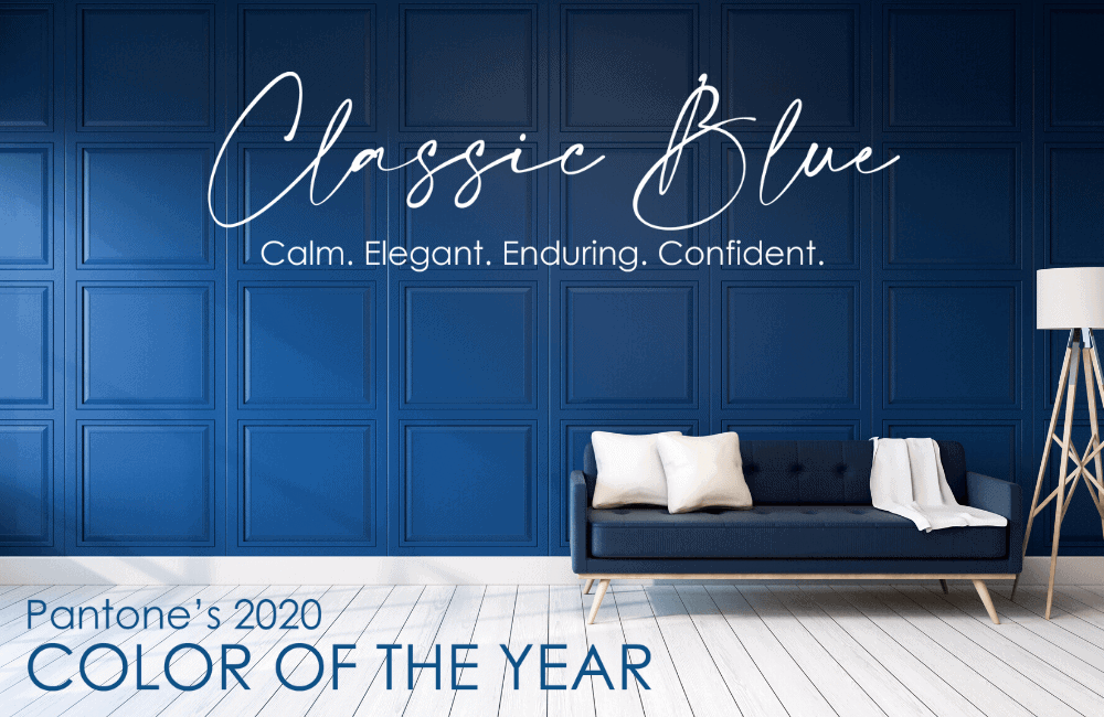
It’s Finally Here: Pantone’s 2020 Color of the Year
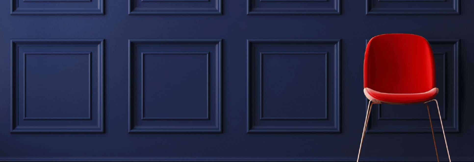
The announcement of the year has been made! Pantone has finally unveiled its 2020 Color of the Year. The lucky winner? Classic Blue! We are loving this timeless and elegant color. According to Pantone, this color exemplifies deep thinking, confidence and tranquility, and we could not agree more. This simplistic yet enduring shade is the perfect foundation for a new decade and better yet, a fresh start.
So, what does it all mean? Pantone’s Color of the Year selection helps set the tone (literally) for that year’s products and will have a heavy influence on anything from graphic to interior design. The long selection process is based on industry and cultural trends. As the first-ever Color of the Year chosen in 1999 was Cerulean, we are brought back to another shade of blue to close out the decade. To better understand the importance of the Color of the Year, we love Meryl Streep’s description as her fashion icon character Miranda Priestly in The Devil Wears Prada. Check out her explanation below.
Leatrice Eiseman, Executive Director of the Pantone Color Institute describes the color as being “Imbued with a deep resonance” and “providing an anchoring foundation. A boundless blue evocative of the vast and infinite evening sky, PANTONE 19-4052 Classic Blue encourages us to look beyond the obvious to expand our thinking; challenging us to think more deeply, increase our perspective and open the flow of communication.” To learn more about the color, we love this article by Time. For an exclusive look at how Pantone unveiled Classic Blue with a multi-sensory experience party, check out this article by CNN. If one thing is for certain as we enter this new era, it is that we will be seeing much more blue! Excellent as an accent color or even as a monochromatic office, there are many ways to incorporate it into your space. Check out these pieces by Haworth and add shades of Classic Blue into your workspace:
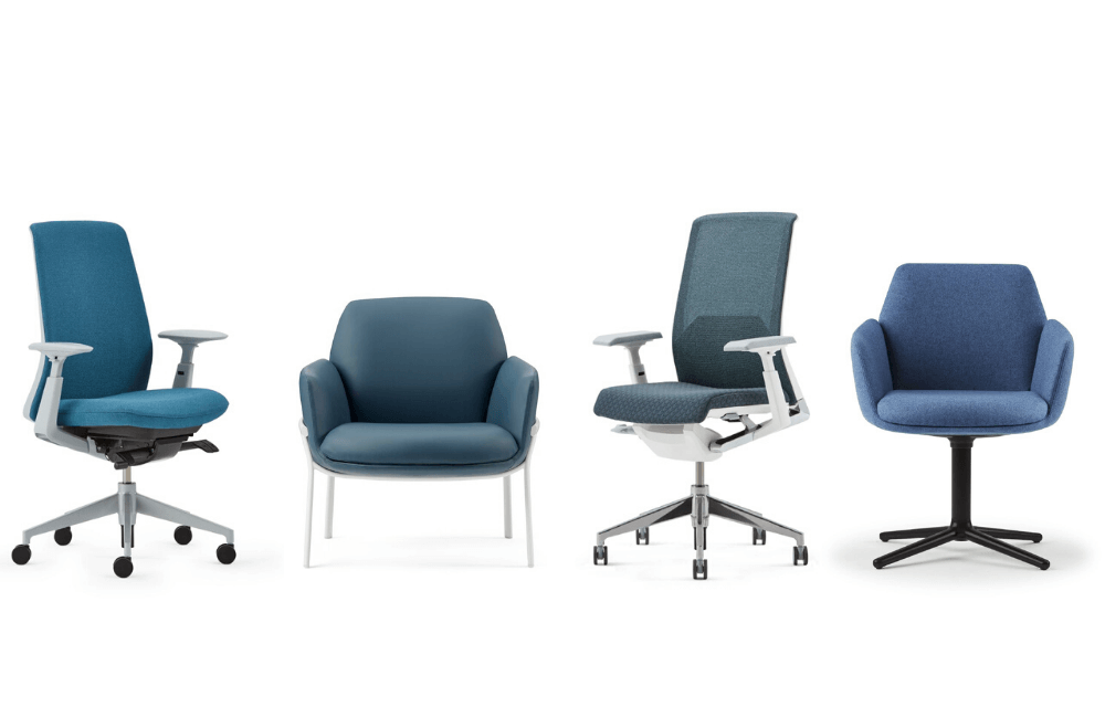
Fern, Very, Poppy Seating by Haworth
Want to incorporate any of these pieces into your workspace? We’d love to hear from you!